The Application of Colors in Signage and For Color-Blind
In this world there is so much colors that have been used in signage. There is so much color that has its own meaning from the unusual color until the well-known color. Those color have the meaning for itself. But the color that been used as sign is differ for each country. Some of them is the same, then the usual sign that has been used is the same for most country. But on some events, the color is being altered for the colorblind people. Nevertheless, not every country implements friendly colors for the color-blinded individuals. For the usual color that has been used for the long time in the most country is:
Blue
Blue is being used as background color for traveler services information signs, emergency evacuation route signs, and as part of Interstate and some state route markers. Because blue is from sky, sky is being used as a direction form the ancient colonization. That’s why it’s being used as the direction. From that moment the blue is identical as the color of direction. Until the modern colonization the color remains used as direction color for sign in many countries. Also, blue is considered beneficial to the mind and body. It slows human metabolism and produces a calming effect.
Blue is strongly associated with tranquility and calmness. In heraldry, blue is used to symbolize piety and sincerity. From then on, blue became the official color for direction. Other than direction, some country also uses the color as the rules sign. The sign can be found in laboratory or may in a public space.
You can use blue to promote products and services related to cleanliness (water purification filters, cleaning liquids, vodka), air and sky (airlines, airports, air conditioners), water and sea (sea voyages, mineral water). As opposed to emotionally warm colors like red, orange, and yellow; blue is linked to consciousness and intellect. Use blue to suggest precision when promoting high-tech products. [3]
Red
Red is the color of fire and blood, so it is associated with energy, war, danger, strength, power, determination as well as passion, desire, and love. Red is a very emotionally intense color. It enhances human metabolism, increases respiration rate, and raises blood pressure. The red is always connected to blood. Because human will bleed when they hurt. When they hurt that means the thing is dangerous and lethal. Also, blood is connected to war.
War is a major problem and can consume a lot of lives. War is existed even before human civilization. From the era of prehistory. Many countries are involved in a war. From the world war 1 until the world war 2. They suffer much of things and lives. They lost both material and family. From that philosophy, the red color become the danger for signage.
Because some signs can tell if it lethal, dangerous or not. Many countries use this red color, so the people can see if it’s a prohibition or not. Some sign in red can be a limit to something like speed limit or maybe an order to not do something. Red is a very emotionally intense color. It enhances human metabolism, increases respiration rate, and raises blood pressure. It has very high visibility, which is why stop signs, stoplights, and fire equipment are usually painted red. In heraldry, red is used to indicate courage. It is a color found in many national flags.
Red brings text and images to the foreground. Use it as an accent color to stimulate people to make quick decisions; it is a perfect color for 'Buy Now' or 'Click Here' buttons on Internet banners and websites. In advertising, red is often used to evoke erotic feelings (red lips, red nails, red-light districts, 'Lady in Red', etc). Red is widely used to indicate danger (high voltage signs, traffic lights). This color is also commonly associated with energy, so you can use it when promoting energy drinks, games, cars, items related to sports and high physical activity. [3]
Green
Green is a color that represents the freedom and calmness. Green is the color of nature. It symbolizes growth, harmony, freshness, and fertility. Green has strong emotional correspondence with safety. Dark green is also commonly associated with money.
Green has great healing power. It is the most restful color for the human eye; it can improve vision. Green suggests stability and endurance. Green, as opposed to red, means safety; it is the color of free passage in road traffic.
Use green to indicate safety when advertising drugs and medical products. Green is directly related to nature, so you can use it to promote 'green' products. Dull, darker green is commonly associated with money, the financial world, banking, and Wall Street. Then green has become the widely known as the safety color and the direction to freedom.
The sign in exit is indicated to direct the people to get outside or can be known as a hint of liberation. Even though some green signs are also being used as safety rules. Green can also be found in laboratories and can be used as the color of safety equipment or safety robes. They are often used by construction workers. Some countries also use the color to indicate product or maybe campaign to the go-green movement. Like recycle sign that can indicate people to put recyclable trash to the bin or indicate product that have been made by recycled product or maybe indicated the eco-friendly environment. [3]
Yellow
Yellow is the color of sunshine. It's associated with joy, happiness, intellect, and energy. Yellow produces a warming effect, arouses cheerfulness, stimulates mental activity, and generates muscle energy. Yellow is seen before other colors when placed against black; this combination is often used to issue a warning. In heraldry, yellow indicates honor and loyalty. Later the meaning of yellow was connected with cowardice.
Use yellow to evoke pleasant, cheerful feelings. You can choose yellow to promote children's products and items related to leisure. Yellow is very effective for attracting attention, so use it to highlight the most important elements of your design. Men usually perceive yellow as a very lighthearted, 'childish' color, so it is not recommended to use yellow when selling prestigious, expensive products to men – nobody will buy a yellow business suit or a yellow Mercedes. Yellow is an unstable and spontaneous color, so avoid using yellow if you want to suggest stability and safety.
But in some occasion yellow is also used as warning sign. The sign is indicating as prohibition. The warning is not as lethal as red. But the meaning is more powerful to the danger and caution signs. Yellow is also used in laboratories as the caution and direction to use something or maybe a procedure to do something. [3]
Orange
Orange identifies dangerous machines or equipment that may crush, cut, shock, or injure workers in other ways. Orange is used on “Warning” signs and labels when a hazard may result in death or serious injury, but when the overall risk isn’t severe enough for a “Danger” sign.
Orange combines the energy of red and the happiness of yellow. It is associated with joy, sunshine, and the tropics. Orange represents enthusiasm, fascination, happiness, creativity, determination, attraction, success, encouragement, and stimulation.
To the human eye, orange is a very hot color, so it gives the sensation of heat. But, orange is not as aggressive as red. Orange increases oxygen supply to the brain, produces an invigorating effect, and stimulates mental activity. As a citrus color, orange is associated with healthy food and stimulates appetite. Orange is the color of fall and harvest. In heraldry, orange is symbolic of strength and endurance.[3]
Orange has very high visibility, so you can use it to catch attention and highlight the most important elements of your design. Orange is very effective for promoting food products and toys.
Many more orange signs that have been used as sign but not many of those signs are used as the danger signs. Mainly the danger signs is using the red color. Maybe on some country they use orange more than red. Orange color also used for the danger stickers. Those stickers indicate injury can be made if the machine or things is used differently.
Among those colors there are colors unperceivable by the color-blinded people. Their condition made it difficult for them to differentiate the signs. That’s why all signs must have picture or text or maybe both, so the color-blind people can read it and know their meaning. Rather than look at the color only. So now I will explain about the color blinds. [3]
Color Blind
Most color blind people are able to see things just as clearly as the rest of the population, the difference is their inability to distinguish red, green, or blue light. The deficiency is the result of a mutation in the X-chromosome – meaning women are more likely to be carriers than sufferers – and it can manifest in 3 main ways.
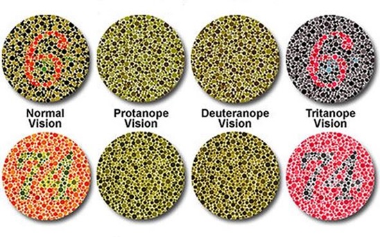
The most common is red/green color blindness, where sufferers mix up all colors which have red or green as part of the whole color. Those affected by Protan color blindness are less sensitive to red light, whilst sufferers of Deuteranopia have the same problem with green. For example, a person with Protanopia will confuse blue and purple because they can’t recognize the red element of the color purple. The third type of color deficiency, Tritanopia, is the least common and refers to sufferers who struggle to distinguish blue or yellow light. The image below shows what the rainbow may look like to individuals with each of these forms of color blindness.
https://www.news-medical.net/image.axd?picture=2014%2F2%2FColor+perception.jpg
There are 4 types of Blue-Green color blind:
- Protanopia : Lacking the red cones for long-wavelength sensitive retinal cones, those with this condition are unable to distinguish between colors in the green–yellow–red section of the spectrum. They have a neutral point at a cyan-like wavelength around 492 nm that is, they cannot discriminate light of this wavelength from white. For a protanope, the brightness of red, orange, and yellow are much reduced compared to normal. This dimming can be so pronounced that reds may be confused with black or dark gray, and red traffic lights may appear to be extinguished. They may learn to distinguish reds from yellows primarily on the basis of their apparent brightness or lightness, not on any perceptible hue difference. Violet, lavender, and purple are indistinguishable from various shades of blue because their reddish components are so dimmed as to be invisible. For example, pink flowers, reflecting both red light and blue light, may appear just blue to the protanope. [1]
- Deuteranopia: Lacking the green cones for medium-wavelength cones, those affected are again unable to distinguish between colors in the green–yellow–red section of the spectrum. Their neutral point is at a slightly longer wavelength, 498 nm, a more greenish hue of cyan. A deuteranope suffers the same hue discrimination problems as protanopes, but without the abnormal dimming. Purple colorsare not perceived as something opposite to spectral colors; all these appear similarly. Deuteranopic unilateral dichromats report that with only their deuteranopic eye open, they see wavelengths shorter than neutral point as blue and longer than it as yellow.[1]
- Protanomaly: Having a mutated form of the long-wavelength (red) pigment, whose peak sensitivity is at a shorter wavelength than in the normal retina, protanomalous individuals are less sensitive to red light than normal. This means that they are less able to discriminate colors, and they do not see mixed lights as having the same colors as normal observers. They also suffer from a darkening of the red end of the spectrum. This causes reds to reduce in intensity to the point where they can be mistaken for black. Protanomaly is a fairly rare form of color blindness, making up about 1% of the male population.[1]
- Deuteranomaly: These individuals have a mutated form of the medium-wavelength (green) pigment. The medium-wavelength pigment is shifted towards the red end of the spectrum resulting in a reduction in sensitivity to the green area of the spectrum. Unlike protanomaly the intensity of colors is unchanged. The deuteranomalous person is considered "green weak". For example, in the evening, dark green cars appear to be black to Deuteranomalous people. Similar to the protanomates, deuteranomates are poor at discriminating small differences in hues in the red, orange, yellow, green region of the spectrum. They make errors in the naming of hues in this region because the hues appear somewhat shifted towards green. One very important difference between deuteranomalous individuals and protanomalous individuals is deuteranomalous individuals do not have the loss of "brightness" problem. [1]
There are 2 types of Blue-Yellow Color Blindness:
- Tritanomaly: Limited blue cone cells. Blue appears greener and it can be difficult to differ yellow and pink. It’s rare and affect male and female equally
- Tritanopia: No blue cell at all. Blue appears green and yellow appears violet or light grey. Also, rare and affecting both male and female equally. [2]
Then that’s the explanation about the color-blind problem. So that’s why some people cannot see well in sign. Even now the problem still exists. That’s why the sign must be made in consideration with the color-blind people.
By: Kevin Chandra
REFERENCES
- MacAdam, David L.; Judd, Deane B., eds. (1979). Contributions to color science. p. 584.
- Retrieved, 6 November 2017 https://nei.nih.gov/health/color_blindness/facts_about
- Retrieved, 4 November 2017 http://www.color-wheel-pro.com/color-meaning.html
Comments :