Colors to Cottage Furniture
Cottage furniture was popular in the United States between 1830-1890. As the civil American war began, cottage furniture began to gain popularity and started to appear in workshops and started to take residency in wealthy places. Due to the popularity of the design, it has became much more simpler and elegant.[4]
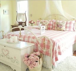
Cottage furniture is much more similar to the Victorian style and luxurious design. The creativity for the furniture, usually in finials and in medallion forms, but most of the decoration was painted. The motif featured in cottage furniture are flowers, fruits and others and the popular base color were tan, blues, greens and pinks.[4]
When we discuss cottage style furniture and decor, these four “rules” come to mind:
- Banish the bland interior. Cottage furniture uses color and pattern to help define space.
- Add texture to your space. Mix and match using casual bright fabrics on your slip covered sofa. Use florals and stripes, checks and plaids, solids and patterns in a coordinated casual cottage furniture theme.
- Create an authentic interior. Emphasize the old and mix with the new. In a typical American-style cottage you are likely to find painted cottage furniture, reclaimed farmhouse tables and cottage wicker, with and without distressed surfaces.
- Set the stage with wood flooring and cottage style area rugs. A cottage floor is meant to be walked on and easy to care for. [2]
Cottage style furniture is often rustic in design, with wood being a primary material used. Many cottage homes are furnished with oak, maple, or cherry wood coffee tables and chairs. It's common to find cabin homes decorated with farmhouse style furniture, more than the modern contemporary designs. Old fashioned wooden rocking chairs are often seen in many country bungalows. Most people prefer cottage furnishings that are functional and versatile, such as a sofa that converts into a bed, commonly referred to as a sofa bed. It is not uncommon to find antique cottage style furniture in a second home. Some people use cottages for displaying antique furniture, such as lamps, tables, or cabinets. Vintage or antique pieces include hand painted, one-of-a-kind end tables or wardrobes. There are types of cottage furniture style, which is farmhouse style, holiday beach cottage, classic cottage and casual cottage and romantic cottage.
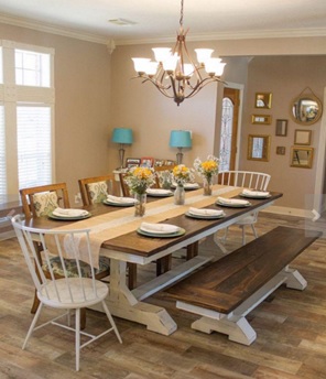
Farmhouse dining
(Source:https://id.pinterest.com/explore/farmhouse-dining-room-table)
Farmhouse dining tables and chairs are a type of cottage style furniture often used in cabins in a rural setting. In addition, plank or trestle tables may be used in place of a traditional coffee table. Wooden barn chairs and occasional tables are also part of country cottage style furniture.
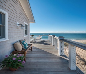
Holiday beach cottage
(Source:http://houseofturquoise.com/2015/06/caldwell-and-johnson.html)
A holiday beach cottage may be furnished with decor that complements a coastal setting. Bedroom sets may include nightstands and headboards with a nautical theme. The wood finish of furniture in a beach home is typically white. Poplar and birch are two types of wood commonly used in furnishings for coastal cottage homes.
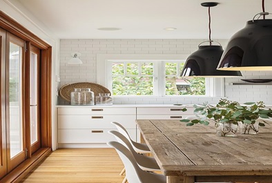
Classsic Cottage
(Source: http://www.cottageandvine.net/2017/05/classics-i-love-white-subway-tile.html)
Classic cottage furniture are where the decor emphasizes clean lines classic shapes. The environment gives the welcoming and comfortable sense to the room.
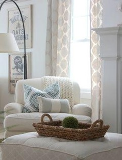
Casual Cottage
(Source: https://s-media-cache-ak0.pinimg.com/originals/b7/ae/3c/b7ae3c8e4de1323c5bc855152f0e310f.jpg)
Casual cottage furniture tend to be a mix and match which means combining the old and new furniture together in a room to create a new atmosphere to the room.
Romantic Cottage
(Source : https://s-media-cache-ak0.pinimg.com/originals/22/14/e2/2214e2bf790334dd7d984741cda01092.jpg)
Romantic cottage furniture and decorating calls for a more feminine touch, with soft pastels, curved lines, and pretty prints.
The basic famous colors of cottage furniture were tan, blues, greens, pinks and warm greys that help to decorate cottage style furniture in the room or house. Colors of room could affect to human physiological or mood and environment.
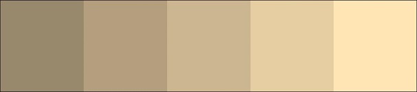
Shades of tan
https://color.adobe.com/Tan-Color-Shades-color-theme-1074347/
Tan or neutral color represent peace and calm to wholesomeness and reliability or even boredom. Especially on the hues blend with almost every other shade to create a pleasing effect. Pale browns for calm, purity and elegance; medium to tan for dullness or conservation; and darker browns for stability, comfort and experience. Beige is also known as tan, buff, cream and even khaki. It varies from nearly brown to very pale cream. It can have warm yellow undertones or pink undertones or be nearly gray. "Greige" seems to be the "It" neutral at the moment. Warm, yellowy beiges look great with teals, turquoises and other yellow-blues. True red looks vivid and elegant next to darker warm beiges. Beige and pink also looks lovely, no matter the undertone. Layering beiges creates a soft, calming look; it makes you feel like you're walking into a room made of cashmere. And all beige tones, no matter how light or dark, work with bright white trim; nothing looks crisper or more traditional than this combo. Beige is a favorite of traditional styles, but it is really everywhere even in wide-open modern spaces and wild, eclectic boho spaces. It's the unsung workhorse of the decorating world. Beige on the Walls, a light, and cool beige in this giant room adds a little warmth but remains steadfastly modern. Light beiges are a great alternative to bright white in modern spaces. A rich, warm beige with bright red is always a winning combination. Bright white trim keeps it all crisp and clean. Layers of beige from a very light cream to a dark tan add to the airy, calm feeling to the room. Beige is a great backdrop for an eclectic room with lots of color. It’s warmer than bright white, and it doesn’t compete with the accessories and furniture the way another color might. Grayish beige gives this hallway a very elegant, very traditional feel. There are different hues and tones on the walls, ceiling, bedspread and floor and, again, the layers create a feeling of sanctuary. A light, creamy beige with glossy true-black trim. It's elegant and less predictable than white. Too often beige is just slapped up as the base color. But it can work as an accent too. subtle and chic beige and cream stripes are a great alternative to the pink and blue nursery. So soft and calming. Pink-beige gives this room a softness that a cooler or darker shade would not. Beige doesn’t have to be the wall color; it can be the trim. Feminine white furnishings are anchored by this dark beige wall color. And it looks great with gold too. Beige walls with a dark beige trim. Painting trim darker than the walls is the opposite of what most people do, and it always looks fresh and modern even here, with traditional wainscoting and other flourishes.[5]

Shades of blue
(Source:https://color.adobe.com/shades-of-blue-color-theme-952479/)
Blues are the hues of serenity, peace and security. Blue works well as both a background and accent color and is a shade that most people can relate to, although it can have masculine properties. Blue is said to bring down blood pressure and slow respiration and heart rate. That is why it is considered calming, relaxing and serene, and it is often recommended for bedrooms and bathrooms. A pastel blue that looks pretty on the paint chip can come across as unpleasantly chilly on the walls and furnishings, however, especially in a room that receives little natural light. Light blue as the primary color in a room, balance it with warm hues for the furnishings and fabrics. To encourage relaxation in social areas such as family rooms, living rooms or large kitchens, consider warmer blues, such as periwinkle, or bright blues, such as cerulean or turquoise. Blue is known to have a calming effect when used as the main color of a room but go for softer shades. Dark blue has the opposite effect, evoking feelings of sadness.[3] Light blue for heath, depth, stability and faith; dark blue for knowledge, power, trust and integrity. Deep blue for encourages efficiency as it will purify our thinking, so could cut through the clutter and discover what is most important in our lives. It helps us to integrate the big picture with the little picture. We can try using deep blue on oversized tray, a wastebasket, a desk lamp or all over the room. While light blue, it dissolves tension and promotes tranquility. Light blue brings ease into home and harmony to room, We can try using light blue color on headboard, flowy drapes or painted ceiling.[4]

Shades of Green
(Source: https://color.adobe.com/Shades-Of-Green-color-theme-2152199/)
Green, secondary color, is one of the most calming and neutral of shades. Green is one of the most versatile colors for decorating. The ability to be a warm or a cool color, allows you to use it for a calming or an energizing effect.[8] You can use green in any room as a wall color, cabinet color, furniture, or accessories. Every color has a meaning or mood. Green is known as the color of abundance and life. Growing grass, leaves, and verdant hills reflect the energy of life. Greens work in many situations, as base colors and accents. This hue is one of the most pleasing to the eye. Be aware of sometimes unintended emotional consequences associated with greens, such as inexperience or sickness.[6] Yellow-greens for sickness and discord; dark green for ambition and prosperity; teal for emotional health and stability; and olive green for peace and harmony. Cool greens have a few color personalities. A sage green, which is muted with gray, is one of the most popular greens in decorating and is often referred to as a neutral. Sage green and other gray-greens can take some trial and error to get the right color because of blue undertones that may be present. A blue undertone may only become apparent once you’ve added sage green near a warm colored item in the room. Medium to light wood cabinets and furniture are often the foils of blueish sage green, because of the juxtaposition of blue and yellow on the color wheel. A warm green might be a better choice if your sage green feels cold next to the existing colors in the room. Green-blue or aqua can also be considered cool greens. These fresh and fun colors are much more straightforward to the eye than sage green. Though they are more vibrant than sage green, they can also be soothing and relaxing
colors. Without the mysterious gray tones, it’s much easier to choose the right color. Aqua is a surprisingly versatile color that transcends beachy decor, into contemporary color schemes with ease. We can try using a green on pot, set of kitchen bowls, bath towel, chair, side table or front door. [3]
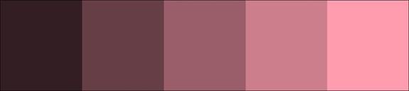
Shades of pink
(Source:https://color.adobe.com/Pink-Color-Shades-color-theme-1074341/)
Pink a delicate color that means sweet, nice, playful, cute, romantic, charming, feminine, and tenderness, is associated with bubble gum, flowers, babies, little girls, cotton candy, and sweetness.[1] It promotes tenderness and is a comfort in times of emotional transition. Use it in a room when you are trying to increase receptivity and understanding. We can try pink on lampshade or table runner.[3]
As we know colors could affect the types of furniture and our moods. For example beige or tan is a favorite of traditional styles, but it is really everywhere even in wide-open modern spaces and wild and
Layers of beige from a very light cream to a dark tan add to the airy, calm feeling to the room. Grayish beige gives this hallway a very elegant, very traditional feel to the room that we could use it classic cottage furniture. Blue give calm and relaxing feeling to the room. Green color also gives calming or an energizing effect to the people. And pink gives a gentle and color of love. If we could use the color to the right place or furniture, room could look very elegant and nice. But if we didn’t use the color proper to the our environment may cause to our mood, health and uncomfortable feelings to our environment.
By: Janice (2001568202)
Reference:
- Retrieved on 5 November ; https://www.bourncreative.com/meaning-of-the-color-pink/
- Retrieved on 5 November ; http://cottagehomefurniture.com/cottage-furniture-styles/
- Retrieved on 5 November ;https://freshome.com/room-color-and-how-it-affects-your-mood/
- Retrieved on 5 November ; http://www.housebeautiful.com/room-decorating/colors/g757/color-meaning/?slide=2
- Retrieved on 5 November ; Jackson Otto, Celia (1965). American furniture of the nineteenth Viking Press. p. 160.
- Retrieved on 5 November ; https://www.houzz.com/ideabooks/4670288/list/color-guide-how-to-work-with-beige
- Retrieved on 5 November ; https://tympanus.net/codrops/2012/04/03/color-and-emotion-what-does-each-hue-mean/
- Retrieved on 5 November ; https://www.thespruce.com/how-to-decorate-with-green-797878
Comments :